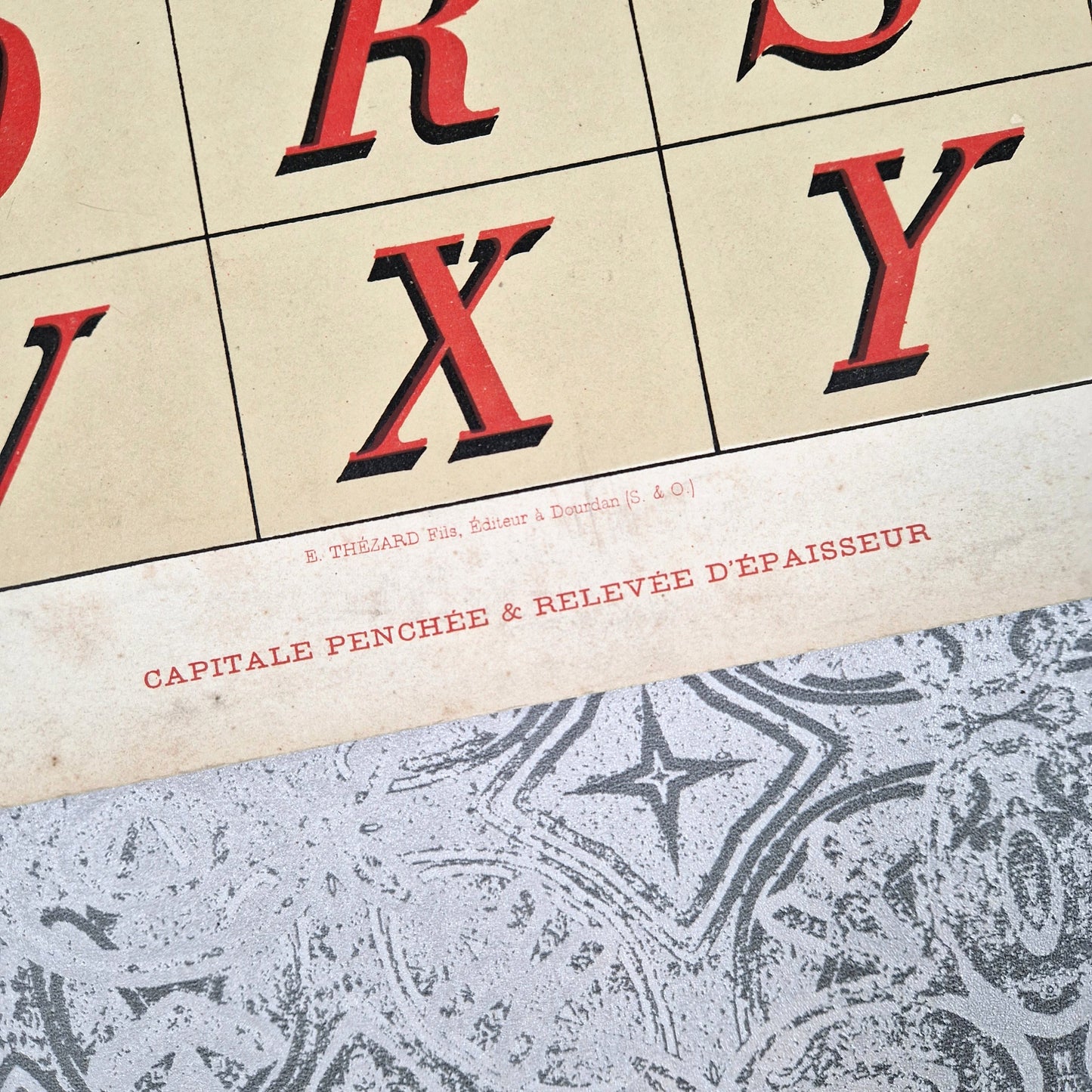
A charming plate from the House Painter's Library , illustrating the "Slanted and Raised Capital" typeface designed by A. Botzum and published by E. Thézard Fils in Dourdan around 1900. This composition features a slanted uppercase alphabet, with red and black letters on an ivory background, expressing the dynamism and elegance of Belle Époque signs. This slanted style, inspired by Roman capitals reimagined in italics, evokes the typography of shop windows, posters, and painted railway carriages of the late 19th century.
✦ Provenance: E. Thézard Fils, publisher in Dourdan ✦ Period: Circa 1900 ✦ Dimensions: 45 × 32 cm ✦ Material: Polychrome lithograph ✦ Condition: Very good overall condition, marginal foxing, colors well preserved.
An alphabet that is both energetic and refined – ideal for decorative framing or Belle Époque typographic collection.